 EN
EN  Romana
 Magyar
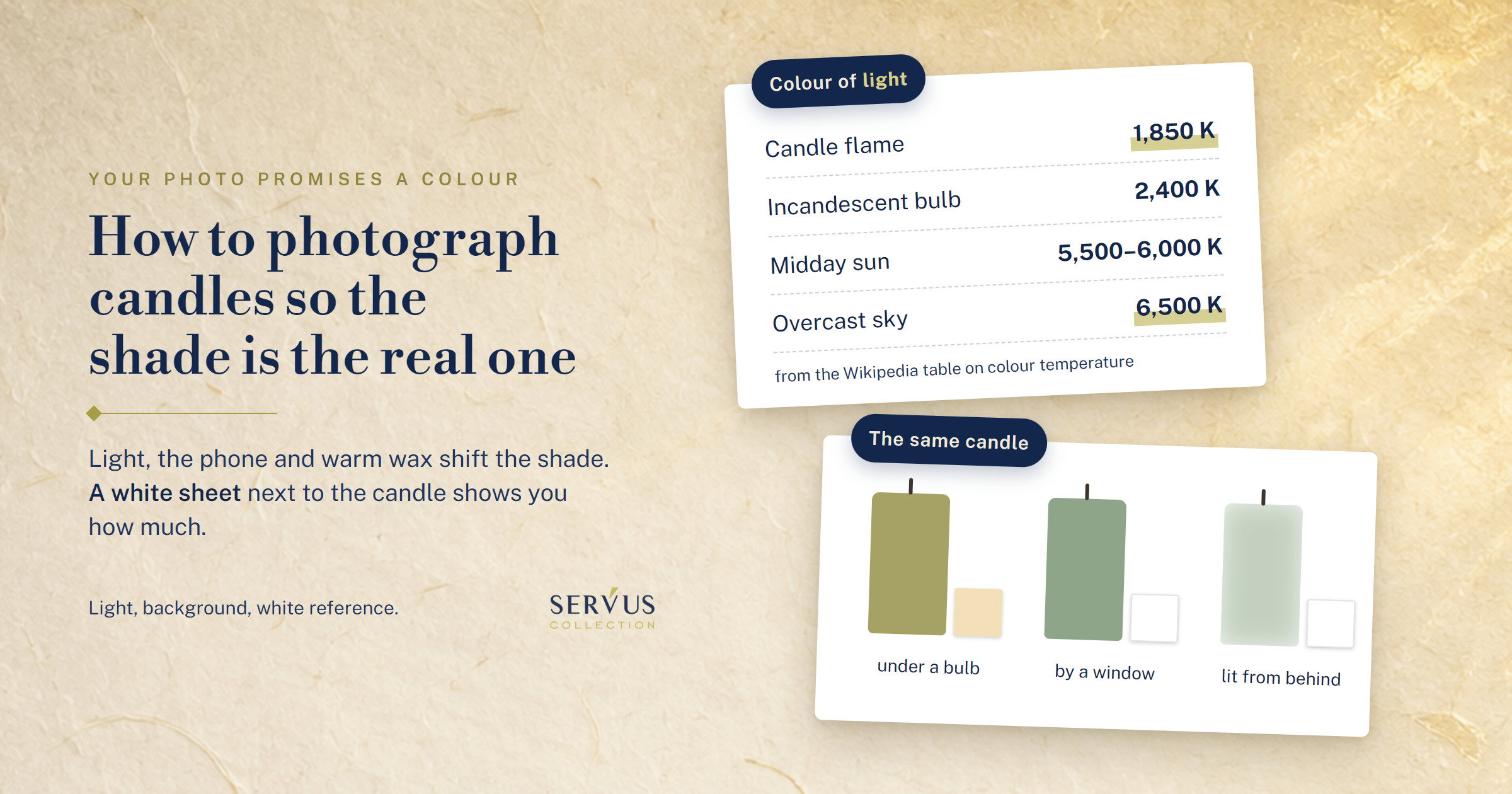
You poured a sage green batch, photographed it in the evening in the kitchen, under the bulb, and the photo came out warm, almost olive. Or you photographed it the next day by the window, with the sun behind it, and on screen it looks lighter and more see-through than it does in your hand. The customer orders from the photo. When they open the box, they compare the candle with the photo, not with what you meant to make.
A photo is honest when you shoot the candle fully cooled and unlit, in daylight without direct sun, with a single light in the room, on a neutral background, with a white or grey reference next to it, and with no filter on the shade. And when, before you post it, you hold it on screen next to the candle, with your phone’s night mode off, and see them the same.
I’m Sînziana. In our workshop in Maramureș, Romania, we’ve been pouring candles since 2010, and we sell on the dyes, waxes and fragrances we work with ourselves. On one of our own candles there’s a review saying the colour looks different from the website. You’ll find it below, with what we learned from it.
Below you’ll find why the colour comes out different in the photo than in your hand, how to take the photo in which the shade is the real one, a table of what you see in the photo and where it comes from, and the list you can keep next to your photo table.
Why does the colour come out different in the photo than in your hand?
Because the phone doesn’t photograph the colour of the candle. It photographs the light that comes back off it, and light has a colour too. On top of that, the phone tries on its own to correct the colour of the light, and wax lets light pass through it. Each of the three shifts the shade without you touching a single filter.
Your eye makes the correction without you noticing: a white sheet of paper looks white to you under the bulb and by the window alike. In the photo, the difference stays.
Light has a colour too: the flame, the bulb and the window
Every light source has its own colour, and photographers note it in kelvins, with the letter K. The lower the figure, the warmer the light, towards orange. In the table on the Wikipedia page on colour temperature, a candle flame is 1,850 K, an ordinary incandescent bulb 2,400 K, the midday sun 5,500–6,000 K, and daylight under an overcast sky 6,500 K.
An ivory candle photographed under a bulb comes out yellowish. The same candle, photographed in the shade on a cloudy day, can come out cold, towards blue. The candle hasn’t changed, the light has.
In the evening, in the kitchen, you often have both at once: the bulb on and whatever still comes in through the window. Then you have two colours of light on the same candle. The side facing the window comes out cold, the side facing the bulb comes out warm, and the phone applies a single correction to the whole photo.
Why does your phone "correct" a coloured candle?
Because the phone guesses the colour of the light on its own and tries to take it out of the photo. That’s automatic white balance, and the same Wikipedia page says most cameras have a function that tries to work out the colour of the light and correct for it.
To guess, the camera looks in the frame for a neutral tone, a grey or a white, to go by. That’s how it’s explained by Pixelz, a company that edits product photos for online shops. A coloured candle that fills the whole frame gives it very little grey or white, so its correction can pull the shade too. That’s why two photos taken a minute apart, from the same spot, can come out different: you moved the phone, a corner of a white table came into the frame, and the correction changed.
Why don’t you show the colour on a lit or freshly poured candle?
Because a lit candle is coloured by its own flame, and a freshly poured one hasn’t reached its final shade yet. The flame, at its 1,850 K, warms everything around the wick towards orange. A photo of the lit candle is good for mood. For colour, you take another one with it unlit.
It’s the same with a freshly poured candle. On our recipes, the warm sample and the wax in the melter came out lighter than the cooled candle, as I wrote in the article on liquid and solid dye. A photo taken on pouring day promises a shade the block no longer has the next day. If the recipe also has fragrance, you wait a little longer: in the article on what fragrance changes in a candle I wrote that the drop shows you the colour at the start, and the candle kept for a few days shows you whether it still moves.
How do you take a photo in which the shade is the real one?
You keep the same, from one photo to the next, everything that changes the colour: the same light, the same spot, the same background, the same white reference in the frame, the candle cooled and unlit. Then you check the photo next to the candle before you post it. You don’t need a camera. The phone is enough, if you have it work under the same conditions every time.
Where do you put the candle so the light doesn’t change its colour?
By a window, in the daytime, with no direct sun on it, with the lights in the room switched off. The light from the window is a single one, and switching off the bulb takes the second colour out of the photo. Direct sun makes hard shadows and blown-out patches, where the shade disappears completely.
You put the window to the side of the candle or in front of it, not behind it. Wax lets light through, and a candle lit from behind looks lighter and more see-through than it does in your hand. If you sell by shade, you want the light on its surface, not through it.
You choose the background once and keep it: warm white or cream, with no coloured wall or large coloured object next to the candle casting its tint onto it. The cream background stays a background, not a reference: the white you judge the colour by is the sheet next to the candle, not the backdrop. And you choose a spot you can come back to, the same window, on the same table. The same spot makes the work simpler, but it doesn’t give you the same light every time, because clouds and the seasons change it. That’s why you check the reference again with every series.
What does a white sheet next to the candle do for you?
It’s your reference. You put something white or neutral grey next to the candle: a white sheet of paper, a grey card, a white tile. If the sheet doesn’t come out white in the photo, the candle doesn’t come out in its own colour either, and you see that at a glance. A white object picked at random can have a tint of its own; a photographic grey card is made precisely to be neutral.
Product photographers use a neutral grey card for this. Pixelz writes, in the guide quoted above, updated in September 2025, that you place it exactly where the product sits, facing the camera, so it gets the same light, and that you measure it again when the light, the time or the location changes. On a phone, if the camera app has a manual or Pro mode, you photograph the reference in the same light as the candle and lock the white balance on it for the whole series. Cameras have had this step for a long time: in the Nikon D850 manual, preset manual white balance is measured on a neutral grey or white object placed under the lighting of the final photograph, and the value is stored in the camera. If the light changes, you measure again. If your phone has no manual mode, you keep the sheet in the frame in every photo, so you have it for correcting.
It’s the same idea as the control candle in the fragrance test, where the old recipe is poured next to the new one. You don’t judge a colour on its own. You judge it next to something you know.
How do you check the photo before you post it?
First you set up the screen, because it changes colours too. On the iPhone, Apple says Night Shift moves the display’s colours to the warmer end, and True Tone adjusts them to match the ambient light. So before comparing, you turn off night mode, the blue-light filter and any automatic colour adjustment of the screen, if your phone has them, and keep the brightness the same every time.
Then you hold the candle next to the screen, in the same light, and look at both at once. If the shade on the screen is different from the one in your hand, you check the light, the exposure and the white balance. You can correct the white balance against the sheet in the frame: Pixelz shows, in the same guide, how it’s done in Photoshop or Lightroom, with the eyedropper on the grey card. If your editing app has a white balance eyedropper, it’s the same move. If the shift can’t be brought back faithfully, you retake the photo.
You can’t control your customer’s screen, every phone shows colours a little differently. Your comparison is a practical check, not a guarantee that the photo looks the same on every screen. You can control the photo. And you can write the colour in words next to it, as concretely as you can: light sage green, matte, not bright green. Words arrive the same on any screen.
What you see in the photo also tells you where the shift comes from:
| What you see in the photo | Where it usually comes from | What you change |
|---|---|---|
| The whole photo leans orange and the white looks yellowish | the bulb on, or the candle’s flame | candle unlit, bulb off, daylight |
| The photo leans blue and the white looks cold | shade or an overcast sky, with automatic white balance left to guess | the white sheet in the frame; white balance set on it, if your phone allows |
| The candle looks lighter and more see-through than it is | light coming from behind and passing through the wax, or the photo taken on warm wax | window to the side or in front; candle fully cooled |
| The shade leans towards the colour of the background | a coloured background or a large coloured object next to the candle | warm white or cream background, the same for every photo |
| The colour is brighter on screen than in your hand | a filter, saturation pushed up in editing, or a "vivid" camera mode | no filter, saturation left alone, then the check next to the candle |
| The photo looks right to you and different to the customer | night mode or adaptive colour on your screen, or the customer’s screen | screen set up before checking; the colour also written in words |
What we do with colour photos
We treat them as a promise to whoever buys. We have a written rule for dye photos, we have a review that showed us where the photo fell short, and we have a step, on personalised candles, where the customer sees their own candle before we send it.
Our rule for dyes: no filter on the shade
In our image rules, there’s a critical rule written for dyes: no filters that change the shade. A dye photo is there so you don’t build the wrong expectation. The background, the light and the framing can be chosen. The shade isn’t changed to look better. Correcting the white balance against a neutral reference is something else: it brings the photo back to the candle, not further away from it.
We ask the same discipline of the colour sample, with any candle dye. You leave the drop of coloured wax on a white worktop until it has fully set and read it in daylight, not under the bulb above the melter, as the article on liquid and solid dye says. Done that way, it’s also your first honest photo: the drop on the white worktop, next to the bottle.
What a customer wrote to us about the fluted baptism candle
On the page of our fluted baptism candle there’s a four-star review from a customer who had ordered from us before and who bought the candles for her own wedding. They arrived intact, she liked the shape, but she wrote that "the colour is a bit more transparent than it looks on the site, I would have liked them to be fuller in colour" (translated from Romanian).
She saw the colour as more transparent than she expected from the photo on the site. The review alone doesn’t tell us where the difference comes from: the light, the angle, her screen or the photo. It tells us the presentation is worth checking, and that the photo is ours. The review has stayed on the page, with its four stars.
And I say this because it happens to anyone selling coloured candles. The customer hasn’t seen your workshop. They’ve seen your photo.
The photo of the candle that’s leaving, sent before the parcel
On personalised wedding candles, the day before dispatch we send the customer photos of their candles on WhatsApp and ship only after they write back that it’s fine. In the article on when to order wedding candles I also wrote why: so the couple sees what they’re getting, not what they ordered. The step exists mainly for the text, which can’t be changed once it’s printed. But it’s also the only moment when the photo shows the very candle that’s leaving.
If you sell to order, this step can be copied. A photo of the candle that’s leaving, taken in the same light as the rest, sent before the parcel, and the customer no longer compares the candle with a catalogue photo.
Where to start
You start from the place you photograph in, not from the phone. You choose the window, the table and the background, put the white sheet next to the candle and take a test photo of a candle from your current batch. You hold the photo next to the candle and look. If they match, you’ve found your spot. If not, you change one thing and retake the photo, just as in the burn test, where you change one thing on the next sample.
What do you check on your next batch photo?
This list can sit next to your photo table:
- The candle is fully cooled and unlit. For mood, you take a separate photo with it lit.
- A single light. The window, in the daytime, without direct sun, with the lights in the room switched off.
- The light comes from the side or the front, not from behind the candle.
- The same background, warm white or cream, for every photo.
- A white or grey reference, in the same light as the candle. You lock the white balance on it for the series, if your phone allows, and measure again when the light changes. Otherwise, the sheet stays in the frame.
- No filter on the shade. You crop and straighten the frame. You correct only the white balance against the reference and the exposure, so the photo reaches the candle, not beyond it.
- The check next to the candle, with night mode and adaptive screen colour off, before posting, plus the colour written in words next to the photo.
In the article on when to start selling, one of the three things you have at the end is a photo of the result with the batch number next to it. Take it here, in this spot, every time.
The photo doesn’t show how beautiful the candle is. It shows what the customer takes out of the box.